Kanji Academy is a digital product meant to help Japanese language learners in their path to master the huge amount of kanji that exists, which is on the thousands. Kanji si known to be one of the hardest aspects of the Japanese language, and providing students with a friendly, usable and comfortable environment can increase their chances of memorizing it. Kanji Academy’s primary focus will be the development of a mobile application to present an accessible tool to language learners, but as the product evolves it aims to be present at multiple digital devices.
Current kanji learning tools for mobile devices are usually presented as cluttered and unusable experiences, making the process of learning less enjoyable and less effective.
The following is the first step into that educational journey, the branding.
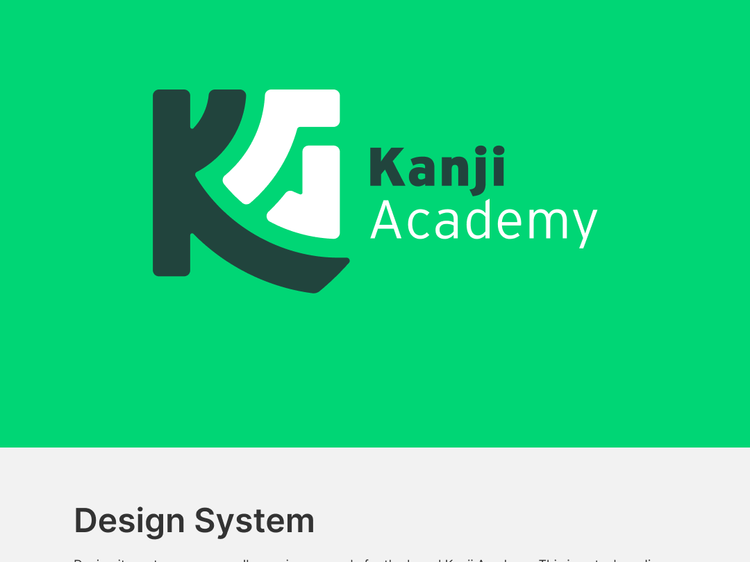
Primary logo application
The concept behind the logo is simple: KANJI!
Most kanji fit very well inside a square, with a few shapes that can break outside of those borders. The initials of the project, KA, had the potential of a visual dynamic that could mimic the general shape styles of the different parts of a kanji, so that was the way to go. The letter K holds the A into position and at the same time provides a subtle disruption of the squared shape.
Photo by @felipepelaquim on Unsplash
A grid combination was used in order to ensure the squared structure of the kanji and provide a dynamic element with the circular motion.
Interstate was the typography of choice. The typography works well because is not too modern, but not too serious, it presents a balance that calls for a modern audience, but at the same time invites the user into an educational context.
The palette of colors is mostly analogue on the cold spectrum of the chroma, without it being boring or too calm. An accent color was added for elements that will require special attention and need to be focal points.
The different applications of color allow for a dynamic environment for the brand.
